Colours are a huge part of our lives. You might not always realise it, but we make a lot of decisions based on colours. Some colours you like (and therefore you buy that green tea mug you really didn’t need, but you just liked the colour so much), and some colours you dislike (and therefore you decided not to buy that one purple, amazingly fitting dress). Studies about the influence of colours have been going on for many decades and now it’s time to use the results to your advantage when designing your website.
First let’s have a look at some numbers. According to H. Khan (2014) 84.7% of consumers say that colour is the most important reason for them to buy a particular product. When looking at physical stores, 52% of shoppers did not return to a store because they did not like the overall aesthetics (which is heavily influenced by the use of colours in the store).
Colours just have an effect on the brain, and each colour can have a different effect. Studies have shown that the effects of specific colours can vary strongly in different cultures. For example in Japan the colour red shows good luck and celebration, happiness and vitality and it’s used for many festive occasions (such as weddings), while in Western countries the colour red is generally associated with danger, anger and love (Empower-yourself-with-color-psychology, 2015). So when designing a website for a Chinese target group, it would be useful to use a lot of red in your design as they will associate your company with good luck and prosperity. If you’re trying to reach a western target group you can better minimise the use of red and only highlight important elements or buttons (as red does call our attention because we’re programmed to respond to this cue for danger).
There’s also a difference in the use of colour when attracting a male or female target group. Men have a tendency to prefer the colours blue, green and black while they hate brown, orange and purple. Women prefer blue, purple and green and dislike orange, brown and grey the most. So when designing a website selling women’s clothes you are wise to use purple, while for a men’s store you would be foolish to use the same colour. In both (all) cases it’s best not to use orange and brown, as both genders have some hatred towards these colours.
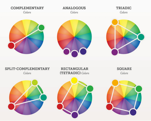
When picking colours it’s smart to have a look if the colour complement each other. Luckily, several colour schemes have been developed that work well together. You can pick:
- Square colours: four colours that are evenly spaced around the colour wheel;
- Triadic colours: four colours that are in a perfect triangle (120° from each other);
- Rectangular colours: four colours divided in two complementary pairs, a rectangle on the colour wheel;
- Split-complementary colours: one base colour and two opposite complementary colours;
- Monochromatic colours: varying tones of the same colour;
- Complementary colours: directly opposite of each other on the colour wheel;
- Analogous colours: one base colour and the colours directly next to it on any side.
(H. Khan, 2014)
So, I think it’s most important to keep in mind that colour have a huge effect on the human brain. The effects differ per gender and per culture. So when picking the colours to use on your website you
- first need to decide on your target group;
- then decide on what you’re trying to achieve;
- and then look into the studies about the meaning of certain colours in certain cultures.
If you pick the right colour scheme and design you website effectively, the colours can definitely boost your sales.


Plaats een reactie